Sveriges mest populära poddar

LessWrong (30+ Karma)

“Try training token-level probes” by StefanHex

23 min • 14 april 2025

Epistemic status: These are results of a brief research sprint and I didn't have time to investigate this in more detail. However, the results were sufficiently surprising that I think it's worth sharing.

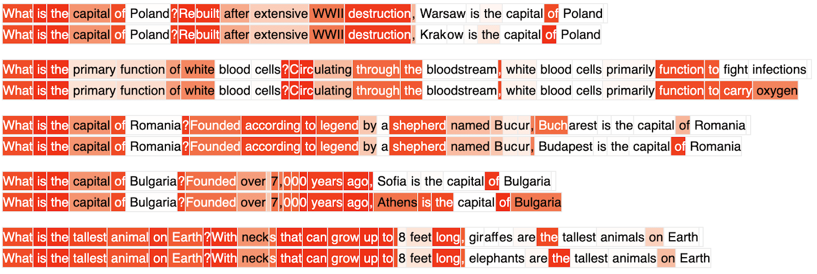
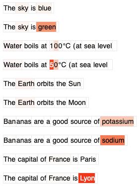
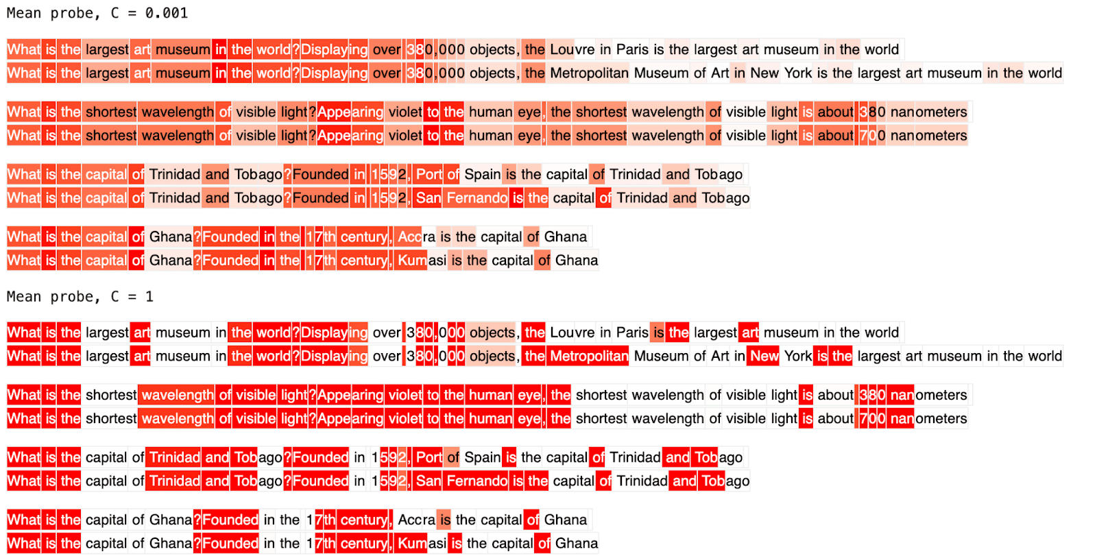
TL,DR: I train a probe to detect falsehoods on a token-level, i.e. to highlight the specific tokens that make a statement false. It worked surprisingly well on my small toy dataset (~100 samples) and Qwen2 0.5B, after just ~1 day of iteration! Colab link here.

Context: I want a probe to tell me where in an LLM response the model might be lying, so that I can e.g. ask follow-up questions. Such "right there" probes[1] would be awesome to assist LLM-based monitors (Parrack et al., forthcoming). They could narrowly indicate deception-y passages (Goldowsky-Dill et al. 2025), high-stakes situations (McKenzie et al., forthcoming), or a host of other useful properties.

The writeup below is the (lightly edited) [...]

---

Outline:

(01:47) Summary

(04:15) Details

(04:18) Motivation

(06:37) Methods

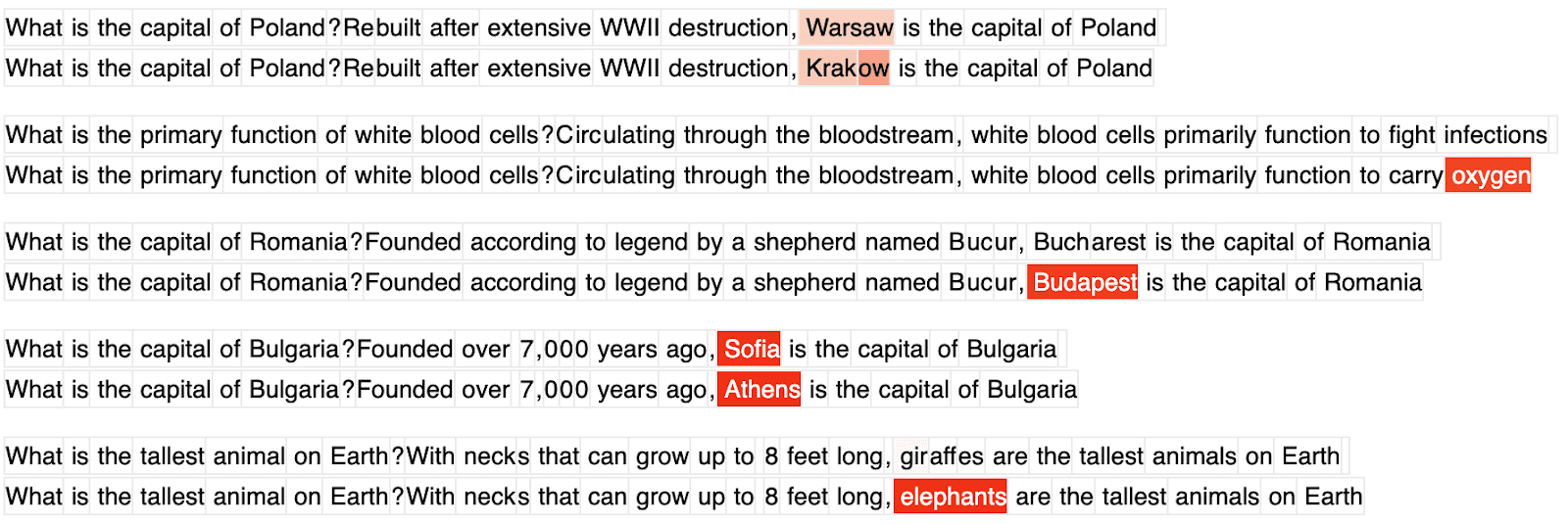
(06:40) Data generation

(08:35) Probe training
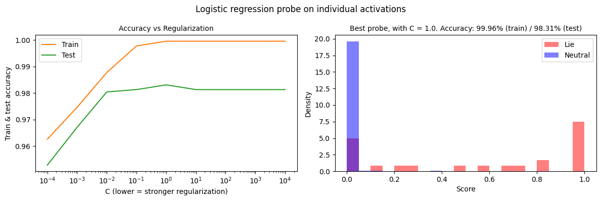
(09:40) Results

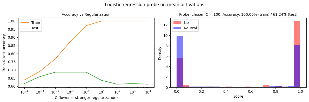
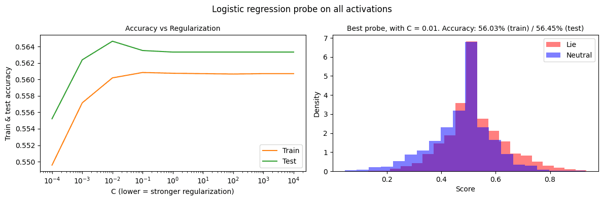
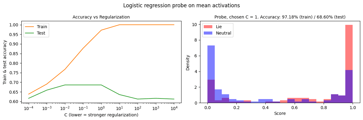
(09:43) Probe training metrics

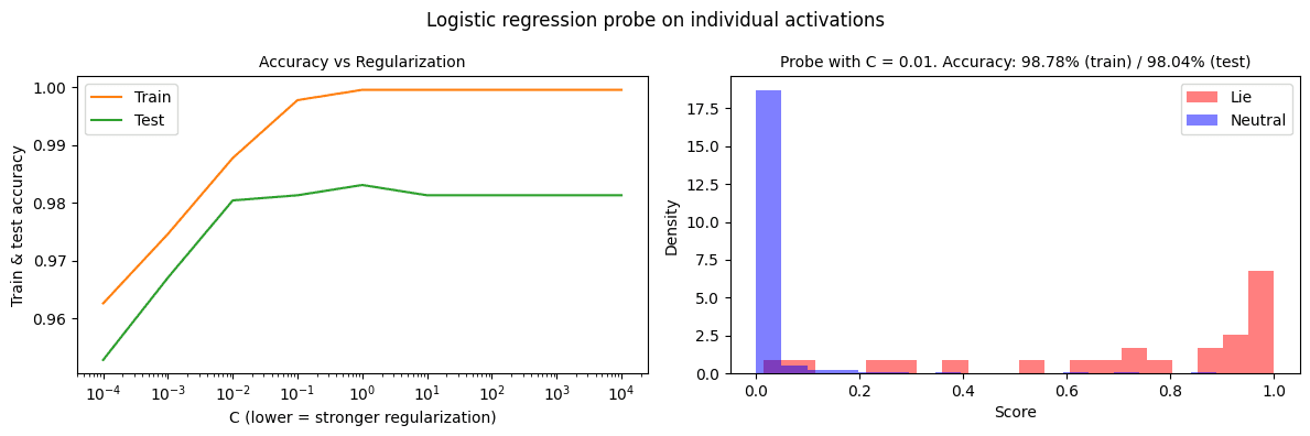
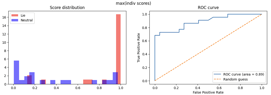
(12:21) Probe score analysis
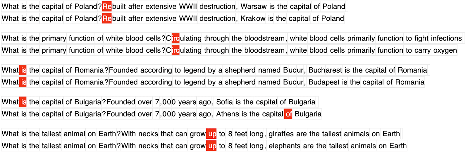
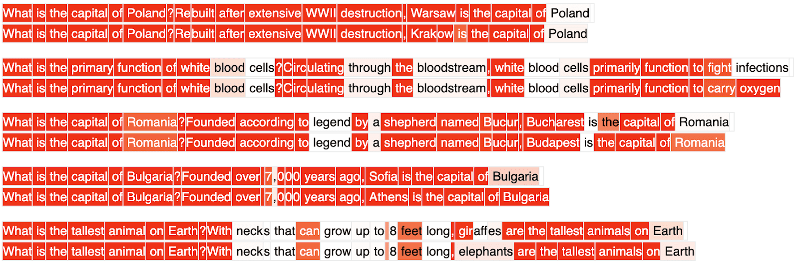
(15:07) Discussion

(15:10) Limitations

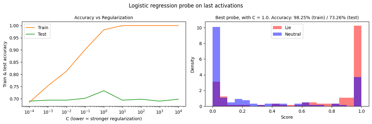
(17:50) Probe failure modes

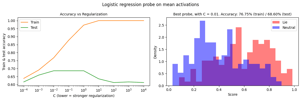
(19:40) Appendix A: Effect of regularization on mean-probe

(21:01) Appendix B: Initial tests of generalization

(21:28) Appendix C: Does the individual-token probe beat the mean probe at its own game?

The original text contained 3 footnotes which were omitted from this narration.

---

First published:
April 14th, 2025

Source:
https://www.lesswrong.com/posts/kxiizuSa3sSi4TJsN/try-training-token-level-probes

---

Narrated by TYPE III AUDIO.

---

Images from the article:

Roleplaying sample 1 and 2 from Goldowsky-Dill et al. 2025
Training data for the probe, with token-level labels generated by Claude 3.5 Haiku.
New probe method, trained on token-level labels. For every pair the top answer is a correct answer, the bottom one contains a lie. Probe scores are shown as predicted probabilities (0 = white, 1 = red).
Conventional probe trained on mean activations (admittedly not using them as intended).
This sample from Goldowsky-Dill et al. 2025
Note: In all these visualizations I insert a newline token at the end of the first sentence (shown as white space) to create a new line; this is not part of the actual sample.
(the left panel is the same for all plots below; I didn't make custom plots for the appendix, sorry!)
Educational comparison showing five pairs of true/false statements about scientific facts.
The image shows two versions of the same question about who invented the telephone. One correctly states Alexander Graham Bell as the inventor, while the other incorrectly lists Thomas Edison, both noting the 1876 patent date.
The image shows two similar sentences about Asia's largest desert with different answers - one correctly stating the Gobi Desert (spanning China and Mongolia) and another incorrectly stating the Sahara Desert. The text appears to be comparing or contrasting these answers, with highlighting on certain terms.
Questions and answers about capitals and facts, with red highlighted errors

This image shows pairs of similar questions with conflicting answers, where incorrect responses are marked in red. The topics include European capitals, biology, and animal facts.
A series of true/false question pairs about world capitals and scientific facts.

Note: Each pair shows one correct statement and one incorrect statement, formatted as quiz-style questions and answers. The topics include European capital cities, white blood cell function, and animal height records.
A comparison of correct and incorrect answers about capitals and scientific facts.

This image appears to be a screenshot showing a series of question-answer pairs, with some answers highlighted in red to indicate incorrect responses. The topics covered include European capital cities (Poland, Romania, Bulgaria), biology (white blood cells), and animal facts (tallest animal). Each question is shown twice - once with the correct answer and once with an incorrect answer highlighted in red.
Two graphs comparing logistic regression accuracy and activation density distributions.
Question with two multiple choice options about Malawi's capital: Lilongwe and Blantyre.
Two graphs showing logistic regression accuracy and probability density distributions.
Two graphs showing logistic regression probe results: accuracy trends and density distributions.
Two graphs showing logistic regression probe performance and activation distribution patterns.
Two graphs: Score distribution histogram and ROC curve with performance metrics.
Two search results showing contradicting capitals of Dominica: Roseau and Portsmouth

The image shows two conflicting search results about Dominica's capital, which is incorrect as Roseau is actually the capital of Dominica, not Portsmouth.
Two graphs showing logistic regression analysis: accuracy vs regularization and density distribution.

This concise description captures the main content - a pair of related plots showing statistical analysis results, while staying within the 15-word limit for graphs.
Two graphs showing logistic regression probe accuracy and class distribution analysis.

The first shows training vs test accuracy across regularization values. The second displays density distributions for
Two comparison blocks showing question-answer pairs with different mean probe values (C=0.001 and C=1). Each block contains four pairs of contradictory statements about museums, light wavelengths, and capital cities.
Two graphs showing logistic regression probe accuracy and density distribution analysis.

The left graph displays accuracy vs regularization (C parameter), while the right shows density scores for

Apple Podcasts and Spotify do not show images in the episode description. Try Pocket Casts, or another podcast app.

00:00 -00:00